
NameSilo has just released a beta version of the new interface, please visit and feel.

To see this interface, you need to visit https://new.namesilo.com.
NameSilo’s new homepage gives the first impression is cool. Smooth blue and the most essential feature boxes of an existing domain name are new registrations, transfer and purchase/sale domain. Really need to scroll down and into specific categories to see significant changes.
The whole homepage is designed as a one-page website, which allows you to simply drag the mouse to get the best overview of the services, features, and utilities that NameSilo provides. Very full, professional without getting too confused is my personal opinion.
Visit other categories such as Register or try to find the domain name right from the home page, you will see the results returned very familiar (like in GoDaddy is right). Steps to choose, buy a domain name is done quickly. Shopping Cart is still the same interface, not much change, just expanded to full screen. The new Transfer section looks nice, professional, convenient to use. As for the Marketplace, I’m more confused than the old one. New theme also shows up well on smaller mobile devices such as phones.
I tried to log into the account management, but still the same, only replace the header and footer corresponding to the home page interface only. Whereas all the content still uses the old style interface.
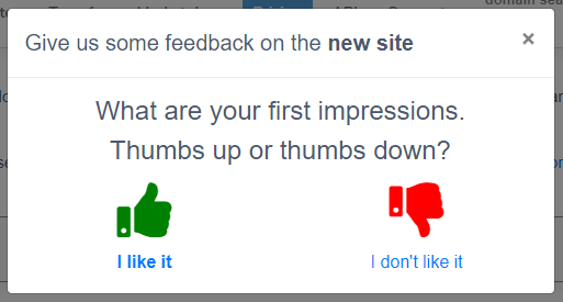
Currently, NameSilo is just running the new interface test, you can still select the old interface (if you want) by clicking the GO TO THE OLD SITE box in the lower left corner of the screen. In addition, this provider also wants to poll the customers when the box set FEEDBACK ON THE NEW SITE? in the opposite corner (bottom right of the screen).
How do you feel about NameSilo’s new look? Like or do not like it? Leave a comment share with everyone!


